> For the complete documentation index, see [llms.txt](https://a.b.cr/llms.txt). Markdown versions of documentation pages are available by appending `.md` to page URLs; this page is available as [Markdown](https://a.b.cr/textbook/frontend/how-to-set-same-height-as-width-in-css.md).
# How To Set Same Height As Width In CSS
## What I wanna build?

I want to create square boxes, however, it really bothered me for a while.
## Let's go straight to the code!
The following examples were created in React and based on [Tailwind CSS](https://tailwindcss.com/), and the information on class names I used can be found [here](https://tailwindcss.com/docs).
### For the best compatibility
```tsx
```
The key to success is a magic `mt-[100%]`. It works because when using **margin/padding-top/bottom** with **percentage**, the value is determined according to the **width** of the containing element which is `w-1/4` for `width: 25%` in my code. Essentially, we have a situation where "vertical" properties can be sized with respect to a "horizontal" property. This isn't an exploit or a hack, because this is how the CSS specification is defined.
### For modern browsers
```tsx
```
Yes! You can actually solve this century problem with a simple `aspect-[1]`, which repesents `aspect-radio: 1;` in CSS.
> The **`aspect-ratio`** [CSS](https://developer.mozilla.org/en-US/docs/Web/CSS) property sets a **preferred aspect ratio** for the box, which will be used in the calculation of auto sizes and some other layout functions.
Thanks to modern browsers, this solution is elegant and easy to understand, and here is the browser compatibility:
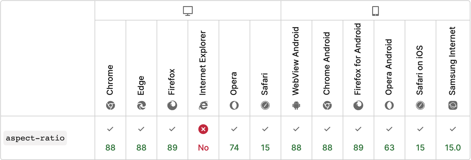
and you can also check it on [Can I Use](https://caniuse.com/?search=aspect-ratio).
## Reference
1. [Height equal to dynamic width (CSS fluid layout)](https://stackoverflow.com/a/6615994)
2. [Maintain the aspect ratio of a div with CSS](https://stackoverflow.com/questions/1495407/maintain-the-aspect-ratio-of-a-div-with-css)