> For the complete documentation index, see [llms.txt](https://a.b.cr/llms.txt). Markdown versions of documentation pages are available by appending `.md` to page URLs; this page is available as [Markdown](https://a.b.cr/textbook/frontend/a-react-ribbon-component.md).
# A React Ribbon Component
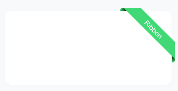
## Target
## Code
```tsx
export default function Ribbon({
width = 100,
height = 20,
text = "",
color = "#4ade80",
}: {
width?: number;
height?: number;
text?: string;
color?: string;
}) {
const sqrt2 = Math.sqrt(2);
const tinyUnit = ((sqrt2 - 1) / 4) * width - (sqrt2 / 4) * height;
const unitOffset = (1 / 2) * width + (sqrt2 / 2) * height + tinyUnit;
const ribbonStyle = `
.ribbonWrapper {
position: absolute;
right: 0;
top: -${tinyUnit}px;
right: -${tinyUnit}px;
z-index: 10;
width: ${width + tinyUnit}px;
height: ${width + tinyUnit}px;
overflow: hidden;
}
.ribbonWrapper::before {
content: "";
position: absolute;
width: ${tinyUnit * 2}px;
height: ${tinyUnit}px;
right: ${unitOffset}px;
border-top-left-radius: ${tinyUnit}px;
background-color: ${color};
background: -moz-linear-gradient(
left,
${color} 1%,
rgba(15, 51, 10, 1) 90%
); /* FF3.6+ */
background: -webkit-gradient(
linear,
left top,
right top,
color-stop(1%, ${color}),
color-stop(90%, rgba(15, 51, 10, 1))
); /* Chrome,Safari4+ */
background: -webkit-linear-gradient(
left,
${color} 1%,
rgba(15, 51, 10, 1) 90%
); /* Chrome10+,Safari5.1+ */
background: -o-linear-gradient(
left,
${color} 1%,
rgba(15, 51, 10, 1) 90%
); /* Opera 11.10+ */
background: -ms-linear-gradient(
left,
${color} 1%,ß
rgba(15, 51, 10, 1) 90%
); /* IE10+ */
background: linear-gradient(
to right,
${color} 1%,
rgba(15, 51, 10, 1) 90%
); /* W3C */
filter: progid:DXImageTransform.Microsoft.gradient( startColorstr='#008a3b', endColorstr='#0f330a',GradientType=1 ); /* IE6-8 */
}
.ribbonWrapper::after {
content: "";
position: absolute;
width: ${tinyUnit}px;
height: ${tinyUnit * 2}px;
top: ${unitOffset}px;
right: 0px;
border-bottom-right-radius: ${tinyUnit}px;
background-color: #000;
background: -moz-linear-gradient(
top,
rgba(15, 51, 10, 1) 10%,
${color} 99%
); /* FF3.6+ */
background: -webkit-gradient(
linear,
left top,
left bottom,
color-stop(10%, rgba(15, 51, 10, 1)),
color-stop(99%, ${color})
); /* Chrome,Safari4+ */
background: -webkit-linear-gradient(
top,
rgba(15, 51, 10, 1) 10%,
${color} 99%
); /* Chrome10+,Safari5.1+ */
background: -o-linear-gradient(
top,
rgba(15, 51, 10, 1) 10%,
${color} 99%
); /* Opera 11.10+ */
background: -ms-linear-gradient(
top,
rgba(15, 51, 10, 1) 10%,
${color} 99%
); /* IE10+ */
background: linear-gradient(
to bottom,
rgba(15, 51, 10, 1) 10%,
${color} 99%
); /* W3C */
filter: progid:DXImageTransform.Microsoft.gradient( startColorstr='#0f330a', endColorstr='#008a3b',GradientType=0 ); /* IE6-8 */
}
.ribbonAnchor {
position: absolute;
bottom: 0;
left: 0;
width: ${width}px;
height: ${width}px;
#overflow: hidden;
}
.ribbon {
position: relative;
z-index: 10;
top: ${width / 4 - height / 2}px;
right: -${width / 4}px;
--tw-rotate: 45deg;
transform: var(--tw-transform);
width: ${width}px;
height: ${height}px;
display: flex;
justify-content: center;
align-items: center;
background-color: ${color};
}
`;
return (
<>
);
}
```
## Reference
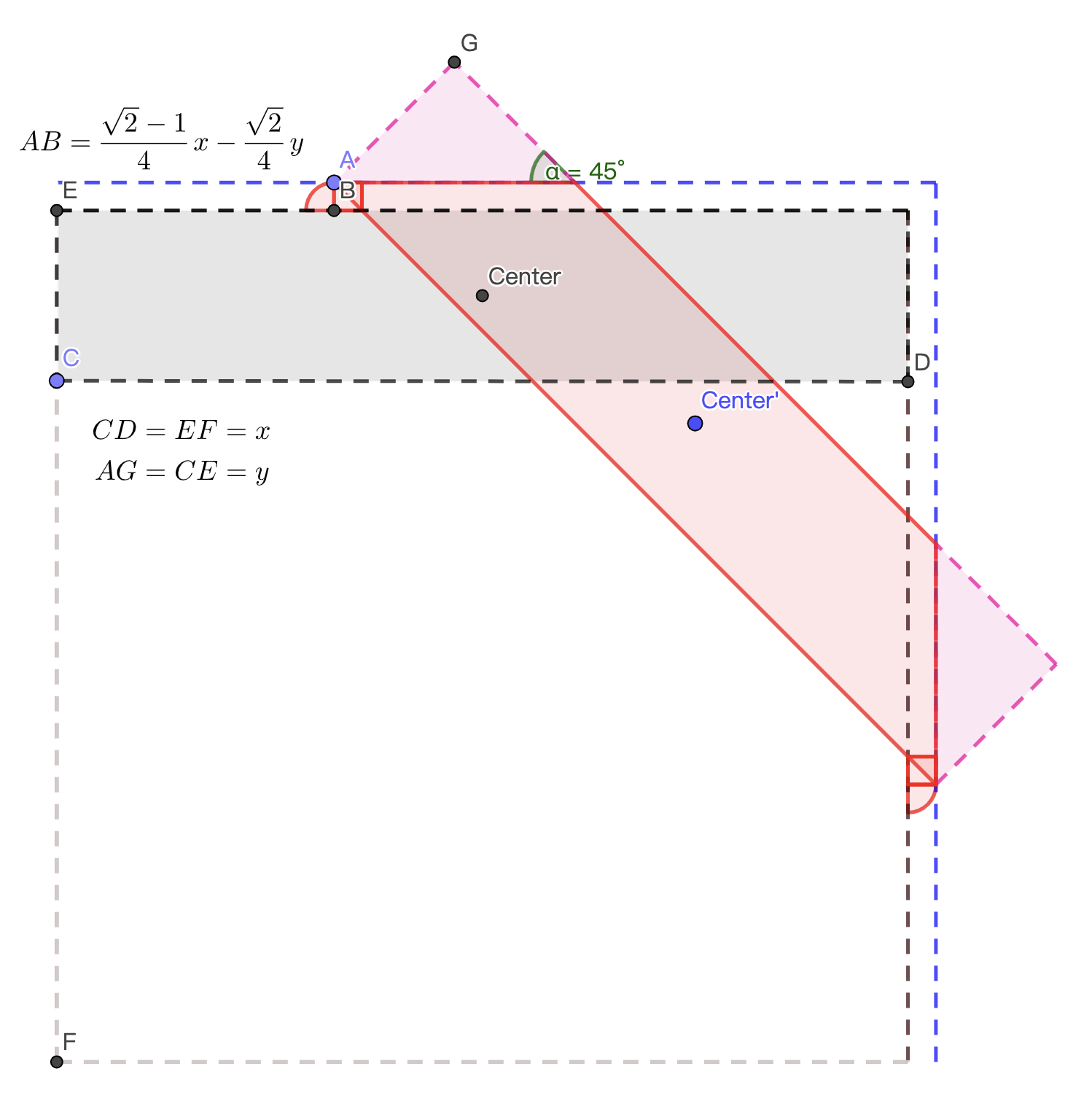
The key to success is **AB**, LOL
The transition is moving the gray box to the red one, and the position of the **Center'** is at **a quarter to the top and a quarter to the right of the square**.
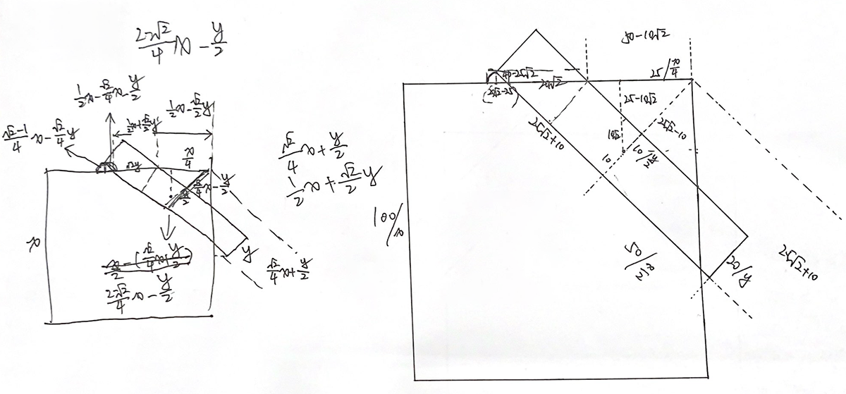
The following is the original version on paper:
And idea from...
{% embed url="" %}